“Your image deserves an agent.”
Agent d’Image is a 360° personal branding agency for executives and entrepreneurs: a single agent runs your image and calls on a selective network of experts as your needs require.
The starting point
A before-and-after cannot be shown. A system can.
Our clients entrust us with their image on condition of discretion, and we keep it. In meetings that denies us the industry’s usual reflex: producing a before-and-after. We chose a different kind of proof, more honest and far harder to fake: documenting, from concept to the finest execution, the brand that carries our own name.
If we know how to build an image that holds, the first one to prove it had to be our own.
Definitions
Brand platform, visual identity, brand identity: four words, four jobs.
Brand platform
The strategic foundation of an identity: positioning, promise and tone, decided before any colour or logo. It comes before the visual identity and is what makes it coherent across every touchpoint.
Visual identity
The full set of visual rules of a brand: colour palette and hierarchy, typefaces, emblem, layout, prohibitions. It turns the brand platform into concrete decisions.
Brand identity
The perceived sum of an organisation’s visual and verbal signals: colour, typography, emblem, writing, tone. It is what makes a brand recognisable without its name.
Brand system
The coherent set of rules and reusable components that lets an identity hold across every medium, from website to printed document, without drifting.
Frequently asked
What we get asked about these terms.
What is the difference between a brand platform and a visual identity?+
The brand platform defines what the brand means: positioning, promise, tone. The visual identity defines how it says it: colours, typefaces, emblem, rules of use. The second always follows from the first, never the other way round.
Does a personal brand platform differ from a corporate one?+
The method is the same. What changes is the subject: a person, with their voice, career and face, rather than an organisation. The visual identity that results has to stay credible embodied by one person, over time.
Who needs a personal visual identity?+
Anyone whose professional image circulates across several touchpoints: executives, entrepreneurs, speakers, public figures. As soon as a LinkedIn profile, a website and social accounts have to tell the same story, a set of rules prevents contradictory improvisation.
Our brand platform
Three decisions, before a single colour.
Everything that follows comes from these. Not one of the three mentions form, and that is exactly what separates a brand platform from a visual identity.
The positioning
A single agent who runs the image of an executive, an entrepreneur or a public figure, calling on a selective network of experts as needs require. Neither a closed firm nor a marketplace of freelancers.
The promise
Your image deserves an agent. The benefit: turning expertise into influence, and influence into opportunity.
The tone
Human and genuine while staying elegant. Inspiring, authoritative, positive, dependable. Never cold, never impersonal.
Turning strategy into form
An image agent puts someone in the light. The identity had to show that, not state it.
This is where strategy becomes form. Rather than a slogan about visibility, we looked for a direction that carries the promise in the material itself. A halo that reveals a face on hover. A mosaic of portraits that gives back in colour what grey takes away. A star that lifts another one, rather than simply shining. The concept became the material, not the wrapping.
The system · colour
One yellow cannot carry a brand. Four, kept in their place, can.
One rule governs everything: the more intense the colour, the smaller the surface it is allowed. That inverted proportion is what stops the identity from shouting.
Applied on Instagram


The system · type
Two typefaces, one job each. Never swapped.
Playfair Display
Headings, and quotations in italic. The voice that asserts, never the one that fills space.
Inter
Body copy, interfaces, captions. It is not meant to be seen; it lets you read.
The system · the emblem
The northern star does not shine alone. It lifts another one.
Eight points in three lengths, with the vertical axis dominant. The elegance does not come from having eight points, it comes from that hierarchy: a star whose points were all the same length would read as a snowflake. As a pair, a small star beneath the large one, it says something else: a progression, a hand held. That is the difference between a symbol and a profession.
The construction
Three point lengths, one ratio to respect: the vertical axis dominates the horizontal, which dominates the four diagonals. That imbalance is what gives the shape a direction, where a regular star would say only one thing, light.
It is also what makes it hard to mistake for a generic stock star: the proportion is the signature, not the number of points.
The star alone
the brand, day to day
The pair
the promise, in one mark
The system · icons
Every pictogram carries the star. Never two icon styles at once.
Rather than a library of generic icons, a single set drawn for the agency: a fine-line pictogram with the northern star nested inside it as a quiet signature. It is not added afterwards, it is part of the drawing.
Online reputation
& SEO
Digital
communication
Image & style
consulting
Bare
reserve
Or ringed
by a circle
Bare reserve inside text and interfaces, ringed by a half-point rule on print and standalone material. One question settles which to use: is the icon accompanying text, or standing on its own?
The system · progress
Progress can be measured. The identity shows it rather than claiming it.
The same gauge that paces the website: an Éclat-to-Miel gradient that fills as you scroll rather than appearing already full. A second of suspense before the proof, so that progress is seen rather than read.
The last figure is honest, not decorative: our own identity has an unfinished stage too. A living identity documents what is left to do as much as what is done.
The system · light
The halo is not decoration. It reveals whatever the cursor approaches.
Move your cursor inside the block below. It is the same gesture as the website hero: a quiet light follows attention instead of demanding it.
The system · the signature
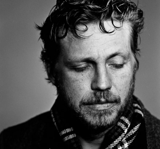
Faces in grey, until someone looks at them.
Hover over the mosaic. Same gesture as on the website: colour rewards attention, it never imposes itself.









The system, in use
The same system, from website to wax seal.



The system · speaking up
A brand is judged on what it publishes.
En Lumière is the agency’s own media: three formats, one grammar. At two hundred pixels, a single yellow chip is enough to say what you are looking at.
Permanent story
Solid Éclat chip, ivory title. The format that never expires carries the boldest yellow, because it stays pinned at the top of the media.
Field note
Ink chip, Éclat text. Colour steps back to a line: the words must land first, not the format.
Client case
Éclat chip, ink text. The one format that talks about a person carries the most legible colour, and never their name.


Click a tile and it opens as a reading card: the same hierarchy as here, with an Éclat panel for the one sentence worth keeping.
Open En LumièreThe system · the threshold
You do not open the media, you step into it.
En Lumière opens on complete darkness and a single point of light. The visitor presses, the light comes. It has become the signature of Agent d’Image®: the brand does not display light, it hands over the switch. The threshold below works.
The rule
One point, never two. Brass ring, a ripple every three seconds, a small-caps line underneath. The threshold black runs deeper than the page ink: that is what makes the switch felt.
The courtesy
The threshold plays once per session, and never for a visitor who has already entered. An “enter directly” link is always there, and the animation stops for anyone whose system asks for reduced motion.
Where it applies
To the media, and to it alone. Services, method and contact open with no threshold: you do not switch the light on twice in the same house.
The rules
A real brand has prohibitions. Here are four.
Never Signal as a solid area. Beyond a small dot it turns garish again.
Never two close yellows side by side. The eye reads a mistake, not a nuance.
Never Expresso on yellow. On a solid field, text stays in ink.
Never three yellows in one block. One block, one intensity, no more.
In practice
What we get asked about how we work.
How long does it take to build a brand platform?+
The strategic foundation is settled in a handful of sessions. The visual identity that follows, and its rollout across every medium, usually spans several weeks to a few months depending on how many touchpoints need covering.
Can a brand platform evolve once launched?+
Yes, and it is meant to: a living identity documents its rules so that they change by decision, not by oversight. That is the difference between an identity that sharpens and one that erodes.
Behind the system
Frédéric Masson Delas
Founder of Agent d’Image®
Twelve years spent observing, in the field, what makes an image last, across consulting, training and speaking. This brand is the first application of what he teaches: an image that holds, because it rests on a system rather than an effect.
View his LinkedIn profile